Medherence
A Medication reminder tool for social good.
The project: Design a User Experience for Social Good
As the third and final project of the Google UX Design Professional Certificate course on Coursera, the prompt I chose was “Design a way to help people remember to take their medication on time”.
This project is still in progress. I will update this portfolio as I make progress :)
The goal:
As someone with many close friends and family who rely on multiple medications, this project prompt was something that felt important to me. The original idea for this product was two-fold:
A mobile app
The mobile app will essentially be a pill box which focuses on the users’ medication schedule and reminders, medicine details and notes for side effects
A complimentary responsive website (in progress)
The complimentary website will include everything above but will also have statistical information, a medical database and information about the users’ inventory, etc
My role:
Entire design process from concept, user research and competitive audits through to wireframes, visual design, iterations, and final prototypes.
Research strategy:
Competitive audits
As part of my initial research, I conducted competitive audits on websites with similar product offerings to what I envisioned for Medherence. These were: Medisafe, Dosecast and Kusuri no Shiori. The first two sites are medicine reminder/tracker type products. The third is a comprehensive medical database.
I chose these two types of site as wanted to incorporate both elements to this project.
I focused my research on user experience flows such as setting reminders, family (parental) settings and an ease of use.
Usability studies
After the competitive audit, I conducted a round of interviews with a target audience of people who rely on various medications and/or have a relative or loved one whose adherence they need to monitor (ultimately this is also where the name for the product was born!) These users were between the ages of 35 and 80. The first round of interviews gave me a lot of insight and fresh ideas for the project.
Findings
Some users were highly forgetful in taking their medication
Users liked diary / scheduling features
Users wanted to track their overall adherence
Users stated that their medication often changed and it was hard to keep track
User stated that sometimes new medications often had side-effects
Insights
Based on the insights above I was able to decide on what some of the core features should be. Some were very different from what I have envisioned and I was glad to get these ideas from test users.
The app should send notifications to family members or care-givers
The diary / schedule feature should be more prominent within the app
Performance data should be included
A remove button should be added to the saved medications and schedule page
The app must have a way to keep notes
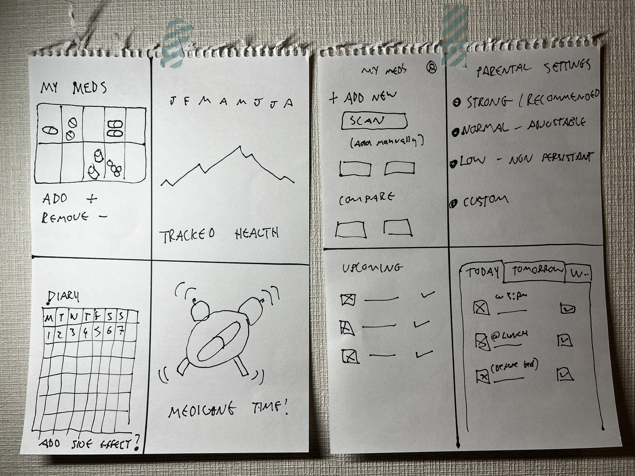
Paper wireframes:
After reviewing these insights I began sketching out some early concepts of where everything should go.
Digitial wireframes:
I took the elements that I thought were the most interesting from each wireframe and built digital versions in Adobe XD.


Lo-fidelity prototype:
Once I was happy with the initial wireframes, I started linking them all together in a low fidelity prototype for the first round of usability tests.
Usability tests (round 1):
The same test users were brought back to try out the lo-fidelity prototype and, based on their feedback, I made a series of affinity diagrams. The feedback was grouped and categorized to give a clearer understanding of the user experience and pain points.
Mock ups:
With the first round of testing done, I applied user feedback, and built the first hi-fidelity mock ups.


Design iterations:
After connecting all the mock ups together as a high fidelity prototype in Adobe XD, I did another round of usability tests in Adobe.com with the same test users. With further feedback I was able to create further iterations of the designs.
Feedback
Some users stated that the colours were not easy to read
Users liked the idea of having an interactive pill box as the home page
There was some confusion regarding the icons in the shortcuts bar
The designs were updated to incorporate the new feedback and I also created various new designs which would include the ability to customise the colour schemes
Feedback and Design iterations Con’t.
Users liked having the option to choose their own colour schemes
Some users would choose a different colour each day of the week
Colour schemes and contrasts were updated with consideration given to WCAG.3 compliance improved the contrast
A colour scheme was also applied to each day of the week to build habit forming
Shortcuts bar icons were improved and text was also added
CTAs and iconography more prominent
Although in general the feedback for each of the designs was positive, for the purpose of this project, I decided to continue with this design.


Design System:
Website and Tablet layouts:
As well as making the design system, I needed to start thinking about phase 2 of the project; the website. The first thing to do was to think about how everything should be laid out and deciding where everything should go. I also did this for tablet format.

This project is still in progress. I will update this portfolio as I make progress :)
Website prototype:


