jalan.net redesign.
Redesigning one of Japan’s leading travel websites.
The project:
As the second project of the Google UX Design Professional Certificate course on Coursera, the prompt was “Redesign a website that you use every day”.
The reason I chose this website was that in using it often myself, I had always felt that it had suffered from cognitive overload, as many Japanese websites do. My initial research suggested that users would prefer something more simple, appealing and better broken down.
Original site can be seen here
The goal:
Redesign a popular website and improve KPI’s such as Time On Task, Ease Of Use and Conversion Rates and ultimately, through better design and user flows.
In my experience coming in to the UX field, I have heard many people say “Japanese users are accustomed to cognitive overload” and for this reason many websites in Japan continue to offer poor UX. This project is based on the idea of “instead of settling for what users are accustomed to, why not take steps to give them what they deserve?”
My role:
Entire design process from concept, user research and competitive audits through to wireframes, visual design, iterations, and final prototypes.
Research strategy:
User research
I planned a usability study with people who currently use the jalan.net website and conducted an initial round of user interviews. These users were all between the ages of 25 and 50. The first round of interviews gave me a lot of insight and additional context for the project.
Target audience:
I interviewed Mimi, Francisco, Jerry, Carlos, and Misato.
As this is a redesign of a Japanese website, the users were all located in Japan and had a range of technical abilities.
User research findings:
Confusion due to cognitive overload immediately from the landing page
Lack of feeling valued due to no splash screen, welcome message or slogan
Lack of trust in the design due to no clear design system. At least 4 different versions of the orange logo colour used.
Overwhelming amount of information with no clear system.
Based on these findings, I made some empathy maps
Paper Wireframes:
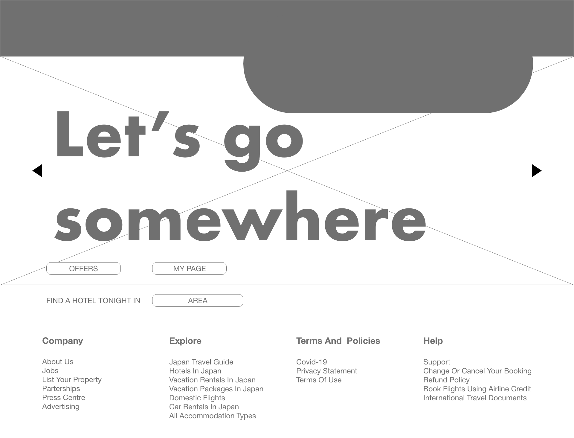
After making empathy maps I began sketching out some early concepts of where everything should go.
Lo-fidelity Prototype:
Once I had some basic ideas for the design and flows I began to make a lo-fidelity prototype.


Usability tests (round 1):
The same test users were brought back to try out the lo-fidelity prototype and, based on their feedback, I made a series of affinity diagrams. The feedback was grouped and categorized to give a clearer understanding of the user experience and pain points.
High-fidelity mock ups:
With the first round of testing done, I applied user feedback, and built the first hi-fidelity mock ups.


Usability tests (round 2):
After connecting all the mock ups together as a high fidelity prototype in Adobe XD, I did another round of usability tests in Behance with the same test users. With further feedback I was able to create further iterations of the designs. This was the stage at which I submitted my project.


