WATCHIT.
A cinema ticket reservation app concept.
The project:
As part of the Google UX Design Professional Certificate course on Coursera, the prompt for this project was “Design a seat reservation app for a movie theatre”.
As the prompt might suggest, the original intention of this project was to design an app for one specific cinema. However, after conducting research and empathising with frustrated movie goers, I learned that users wanted more than simple iterations of what was already on offer and so the concept of this app grew.
The goal
Develop an appealing functional app that is not tied to one specific movie theatre and focuses on the user’s circumstances, is more user-friendly, and increases user trust.
My role:
Entire design process from concept, user research and competitive audits through to wireframes, visual design, iterations, and final prototypes.
Research strategy:
User research
In order to identify the common pain points in current available apps, I conducted an initial round of user interviews with people that fit the target audience. These users were all keen movie goers between the ages of 25 and 50. Before I began the interviews I also conducted competitive audits which also gave me a lot of insight, provided me with some of the interview questions and additional context for the project.
Competitive audits
As part of my research, I also conducted competitive audits on two apps and websites with similar product offerings to WATCHIT and a third, indirect competitor. These were: TOHO, United Cinemas Japan and K’s Cinema (Shinjuku, Tokyo), respectively. I focused my research on user interface elements and user experience flows such as the sign up process, payment processes, “premier” reservations and search features.
Target audience:
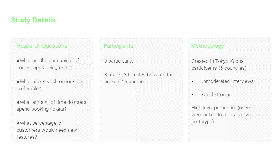
I interviewed 6 different people: Sam, Jason, Conor, Makiko, Gustav and Mary.
The users were located in Japan, the UK and Singapore and had a range of technical abilities.
User research findings:
Frustration with complicated user journey map
Lack of control over booking preferences
No personalized approach for users
Stress from “high commitment factor” (inability to cancel without charge)
Hard to reserve last minute tickets
Lack of “community” (reviews, peers, etc)
Wireframes:
Based on these findings, I made empathy maps and began sketching out some early concepts (I didn’t have paper and a Sharpie nearby so these were done on my iPad) :)

Lo-fidelity Prototype:
Once I had some basic ideas for the design and flows I began to make a lo-fidelity prototype.


Usability tests (round 1):
The same test users were brought back to try out the lo-fidelity prototype and, based on their feedback, I made a series of affinity diagrams. The feedback was grouped and categorized to give a clearer understanding of the user experience and pain points.
From this point I was able to clearly define which aspects of the designs and flows needed iterating. These themes, insights and recommendations can be seen in this slideshow:
High-fidelity mock ups:
With the first round of testing done, I applied user feedback, and built the first hi-fidelity mock ups.


Iterations on designs: (Purple color palette abandoned)


Usability tests (round 2):
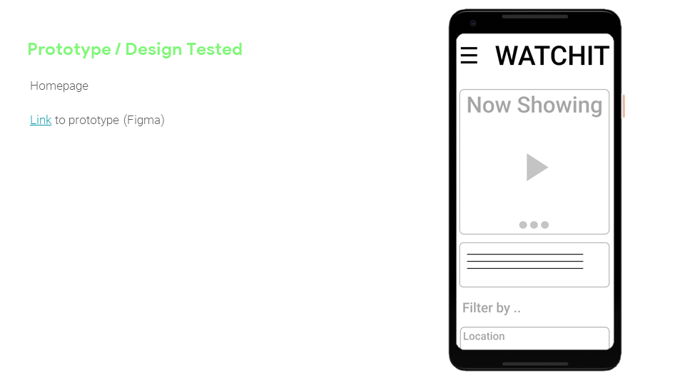
With the mock ups finalized I built a high fidelity prototype and conducted usability tests in Figma with the same test users. With further feedback I was able to iterate more on the designs, user and flows. This was the stage at which I submitted my project.


